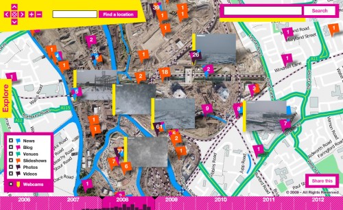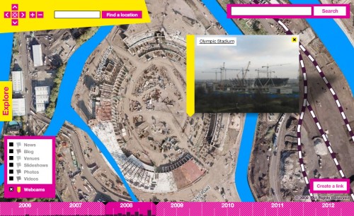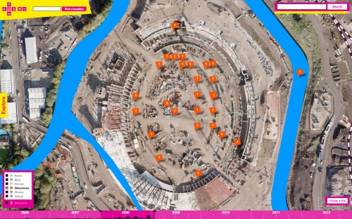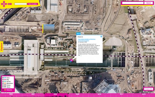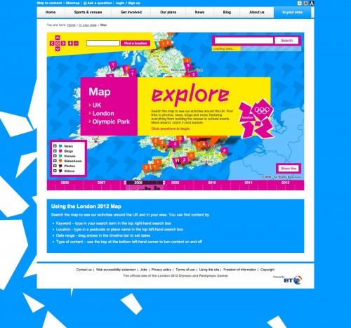
At Stamen we've just finished building a new map for LOCOG (the London Organising Committee of the Olympic Games). This map builds on the work we did last year, with some new work on the back-end to expose a wider variety of content and another round of improvements to the Modest Maps powered front-end. This time we're trying to organise and make spatial sense of the thousands of geocoded articles and photos that the London 2012 team are producing, highlight the ongoing works in the Olympic Park, London and the UK, and showcase the depth and breadth of information available on the main site.
As always when we've just released something, I haven't had a lot of time to reflect on what's been done since I stopped working on it every day, but I wanted to get some words down while the paint's still wet. As always, but sometimes it's important to state clearly: I write for me here, not for Stamen (though I'm not sure what I'd change) and certainly not for LOCOG (you shouldn't take any of this as an endorsement from them). As always, and sometimes you can't say it enough: not all the work shown here is by me, I'm part of a bigger team at Stamen and almost all of us had a hand in this one. We also have very attentive and supportive clients!
We've had a lot of fun paying attention to their brand; going to town with the bright colours, seamless transitions, polygon shards, flags and so on whilst keeping that controversial logo moving nicely. It's sometimes tricky to stay within the guidelines and still have things make sense on top of the maps we've made, but the style guide is tough but fair and it's definitely worth it in the end. Since the branding already pushes things from the graphic design standpoint we've taken the opportunity to push the interactive end of things. The map allows you to filter the content by category, time, search terms and place, with all those (except the search terms) happening client-side to give you an immediate update.
From a technical standpoint the trickiest bit was getting the clustering right. It uses multiple levels of the UK's administrative hierarchy behind the scenes to group different categories of content together into those numbered and coloured flags. When you click on a flag we display an info bubble with tabs containing excerpts from all the content. All of those elements update when the filters change, either immediately or with a slight (and hopefully imperceptible) pause, and hundreds or thousands of animations get kicked off every second if you drag the time slider. With all that going on, the clustering had to be robust!
It's one thing to identify that your map has too much content when it's zoomed out, or that when you're zoomed in some things are overlapping. But it's another thing to group things together in intuitive ways, and yet another thing to have those groupings behave appropriately with other UI elements, and to have the content (which is really all that matters) remain accessible at all times. Throughout the final stages of the project we were worried about cramming too much stuff into the info-bubbles that appear when you click on the flags, and we considered sending you to a separate page section below the map to read extended search results. In the end though we went with the tabbed info bubble approach (I felt a little better about this idea after seeing that people like Mapeed were taking a similar approach). This can sometimes present you with a lot of scrolling to do, but with the added control given by the filters (and the constant updating of the content in the info bubble) we're happy with how that turned out.
Anyway, it's not all about technical achievement, even if that was my personal focus. Some of the features are very simple conceptually, such as showing and hiding webcams depending on whether you're zoomed-in or not. But if you zoom into the park and it happens to have snowed, you can be greeted with a pleasant surprise:
And sometimes we're really just trying to get out of the way, so that the park can speak for itself:
What's next? Well I probably shouldn't say... but since it's custom cartography season at Stamen at the moment, and we all make our interests public, you might be able to guess where we'll take things next. We'll see!
